The Making of "The Bath Crone," Pt. 2: Assumptions
(This is Part 2 of my series on the making of my 3D comic, "The Bath Crone." You can read Part 1HERE, and you can read the comic HERE. It takes only a few minutes to read.)
I started thinking about 3D comics so long ago that the assumptions I held then about comics, 3D, 3D comics, and even art in general have changed a lot. Some facts I thought were true turned out to be demonstrably untrue, and some beliefs I held dearly I no longer believe. All of this stuff that I’ve more or less abandoned lead to my then AND current conception of 3D comics, so I thought I’d take this post to explain my thought process as I went from my initial spark of inspiration to the finished product that is "The Bath Crone." Just so whether you more align with me now, or me then, or even me never, you can better understand why my personal vision of what 3D comics is the way it is.
I think the biggest difference between me now and me then (where it relates to comic theory, anyway) is my belief in formalism. I read all of Scott McCloud’s books on comics theory and whatever else I could find on the topic, and I strongly believed that comics were defined by certain immutable features. Scott McCloud famously defined comics as “juxtaposed pictorial and other images in deliberate sequence,” but I related more to his simpler and more exciting formula for comics: “SPACE = TIME.” In this formulation, space (the page) was the currency that comics had available to spend, and by being read it converted this currency of space into time in the mind of the reader. This idea became very relevant when I began to think about 3D comics. It was an obvious leap to make that if the 2D space of the comics page could represent time, so too could 3D space.
The problem was that you couldn’t exactly experience 3D space in the same way you experience 2D space on a page. You have to move through it rather than just scan your eyes over it. This was an easy problem to solve, all I needed to do was to conceptualize the camera/player character that commonly walks through the 3D spaces of games as an eye in the context of a 3D comic. Where in a 2D comic your eye moves from top to bottom and left to right when reading a comic page or panel, in a 3D comic your virtual eye would move further IN and AROUND to read the space.

The bigger problem was the page and the panels that the eye moves over in 2D comics. How could these fundamental units of comics be translated into 3D? After thinking a lot about it I came to the conclusion that they couldn’t really be translated very directly, at least not in a way that wasn’t incredibly clumsy. I think this point is probably the biggest fork in the road for people who try to conceptualize what a 3D comic might be like. If you give up the familiar grammar of panel borders, gutters, and page breaks is it really even a comic anymore? I think most people would be unwilling to jettison these things, but trying to insert a fundamentally 2D unit of space into 3D is misguided.
Initially it might seem like a simple fix. A 2D panel is a rectangle, so a 3D panel would be a rectangular prism, a room. The problem with this becomes obvious as soon as you try to apply different types of stories to this format-- not every space is a room. The thing is that spaces in 3D are NOT just units of time and story, they are also just spaces, spaces that you exist in. How can you expect to see a panel border, much less a gutter, from inside the panel? How can you expect to contain a mountain in a room without robbing it of its inherent spatial qualities?
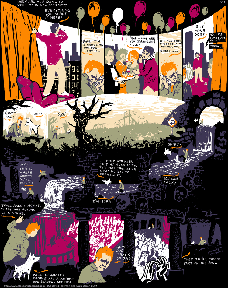
I found my personal answer to this question in comics that, in whole or in part, do away with panels or lean more heavily on sequential sequences WITHIN panels. This is far from an uncommon thing for comics to do, and even the most conventional comics do it, though I looked more to experimental comics that took it to extremes. I think the easiest way to explain what I mean is just to show you this page from the webcomic A Lesson Is Learned But The Damage Is Irreversible that I thought about a lot in the early stages of figuring this all out:

The sequence in the center of the page is one I kept thinking of as I tried to imagine what a 3D comic would actually be like in practice. You can see many common techniques that other comics use to tell stories without the use of strict panel borders, such as substituting elements in the environment for borders (such as the columns and broken sections of wall,) spatial continuity that allows readers to track the movements of the characters (Dale and the ghost dog's whole journey through the catacomb river,) and the duplication of one character within the same unit of space in different points in time (seen in the left-most part of the underground river section, as Dale jumps over the waterfall.) What is fairly unique to this comic is the extent to which space dictates the flow of the story, with the artist, David Hellman, going so far as reverse the direction the comic is read halfway through. To me this seemed like the sort of tailoring of the storytelling to the unique properties of the space at hand that would be required to make a 3D comic work.
One thing that would keep bothering me is that u-turn sign at the entrance to the river. I couldn't decide if Hellman had placed it there as an extra little joke on his own layout, as a bit of security to guard against confusion, or as absolutely necessary signage needed to make the odd reversal work. The water bothered me almost as much, what with the slight dip toward the left signaling to the reader the way the water, as well as the comic, was supposed to flow. To what extent would this sort of signage and subtle guidance be necessary to make a panel-less 3D comic work? And would the medium collapse under arrows and nudges? I now think this sort of thing can happen much more naturally in a 3D comic.
As you can see sequences of panels are far from the only thing comics use to convey a progression. More than anything panels resemble punctuation, creating units out of less rigid sequences, like how periods create sentences out of phrases. Given this resemblance, all I had really figured out in my quest to rid 3D comics of panels is that it was perfectly possible to create the equivalent of a run-on sentence in the medium using the tools 2D comics had already developed. I was concerned about this, I didn’t want to create 3D comics with no sense of pacing or structure or separation between moments.
My solution to this lay not in the conventions of comics at all, but in the conventions of 3D space. Luckily, 3D space has its own sort of grammar. The basic unit in 3D comics would not be the panel, but an area of interest. It’s natural to travel continuously through (more or less) empty space, and to stop at points that hold something of interest. This rhythm of exploration can be repurposed to pace and punctuate a story.
The function of panels is to break up space into units and focus the reader’s attention on one unit at a time. On the 2D space of the page your eyes can jump instantly from any point on the page to any other point, and without the structure of the panel grid it can be hard to keep the eyes of the reader on the intended track. In 3D this problem solves itself, with the limitation of travel. You cannot take in any part of the space at any time, you are restricted to what’s directly around you until you move to a different area. This allows areas of interest to function similarly to panels, and with the aid of visual cues like obstructions, light and darkness, detail and relative emptiness, these areas can be clarified into identifiable units for the reader.
With this I felt like I had solved the basic, foundational problems of transferring comics into the medium of 3D space, and I was ready to move on to the particulars.
(Next time: how 3D comics work)
The Bath Crone
A 3D comic you walk around in.
| Status | Released |
| Category | Comic |
| Author | Desktop Metaphor |
| Tags | 3D, Atmospheric, Colorful, Exploration, Fantasy, First-Person, Narrative, Short, Singleplayer |
More posts
- The Making of "The Bath Crone," Pt. 3: StillnessMar 28, 2020
- The Making of "The Bath Crone," Pt. 1: OverviewMar 26, 2020
- "The Bath Crone" ReleasedNov 18, 2018
Leave a comment
Log in with itch.io to leave a comment.